

In today's data-driven world, cities are constantly seeking ways to improve their performance and enhance the quality of life for their residents. One powerful strategy for achieving these goals is benchmarking against peer cities. By comparing key metrics and performance indicators with similar urban centers, cities can identify areas for improvement, learn from best practices, and develop effective strategies for growth and development. However, raw data alone can be overwhelming and difficult to interpret. That's where visualization comes in. By transforming complex datasets into intuitive visuals, cities can gain deeper insights, communicate findings more effectively, and make more informed decisions.
The Power of Visualizing Peer City Data
Visualizing peer city data offers numerous benefits for benchmarking and strategy development. Here are some key advantages:
Enhanced Understanding: Visualizations, such as charts, graphs, and maps, make it easier to identify patterns, trends, and outliers in the data. This can help cities quickly grasp the relative performance of their peer group and pinpoint specific areas where they excel or lag behind.
Improved Communication: Visuals are a universal language that can be easily understood by a wide audience, including policymakers, city staff, and the general public. By presenting data in a clear and concise visual format, cities can effectively communicate their findings and gain support for their strategic initiatives.
Data-Driven Decision-Making: By providing a clear and comprehensive view of the data, visualizations empower cities to make more informed decisions based on evidence rather than intuition. This can lead to more effective policies and programs that are tailored to the specific needs of the community.

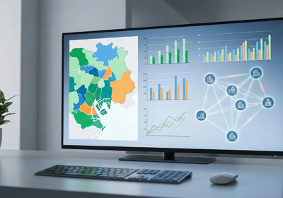
Tools and Techniques for Visualizing Peer City Data
There are a variety of tools and techniques available for visualizing peer city data. Here are a few popular options:
Geographic Information Services (GIS) Mapping: GIS mapping is a powerful tool for visualizing spatial data, such as population density, land use, and transportation networks. By overlaying peer city data on a GIS map, cities can quickly identify geographic patterns and disparities, such as the distribution of resources and the concentration of poverty.
Interactive Dashboards: Interactive dashboards provide a user-friendly interface for exploring and analyzing peer city data. These dashboards typically include a variety of charts, graphs, and maps that can be customized to focus on specific metrics and indicators. Users can also drill down into the data to gain more detailed insights.
3D Map Rendering: 3D map rendering offers a realistic and immersive way to visualize urban environments. By creating 3D models of peer cities, users can gain a better understanding of the built environment and how it impacts various aspects of city life, such as traffic flow, air quality, and property values. It is also beneficial in GIS urban planning.
Interactive Map for Website: Embedding an interactive map on a website helps inform stakeholders and allows them to explore GIS mapping data, which can be very useful for increasing transparency with the public.
Best Practices for Visualizing Peer City Data
To ensure that your visualizations are effective and informative, it's important to follow some best practices:
Define Your Objectives: Before you start visualizing data, take the time to define your objectives. What questions are you trying to answer? What insights are you hoping to gain? By clearly defining your objectives, you can ensure that your visualizations are focused and relevant.
Choose the Right Visualizations: Different types of visualizations are better suited for different types of data. For example, bar charts are great for comparing discrete categories, while line graphs are ideal for showing trends over time. Select the visualizations that best represent your data and help you answer your questions.
Keep it Simple: Avoid cluttering your visualizations with unnecessary information. Focus on the key data points and use clear and concise labels and annotations. The goal is to make your visualizations easy to understand at a glance.
Benchmarking against peer cities is a valuable strategy for driving urban innovation and improving the quality of life for residents. By visualizing peer city data, cities can gain deeper insights, communicate findings more effectively, and make more informed decisions. Flyer View Group is dedicated to helping communities thrive, offering services like community profiles, GIS/Mapping, and interactive maps for website integration. Contact us today to learn more about how we can help you visualize your peer city data and unlock valuable insights for your community.