
In today's data-rich environment, web maps have become powerful tools for visualizing and interacting with complex information. However, a common challenge arises when these maps become overloaded with data, leading to user confusion and hindering effective decision-making. Mastering the art of presenting information clearly and concisely is crucial for creating user-friendly and impactful web maps.

Strategies for Managing Information Overload
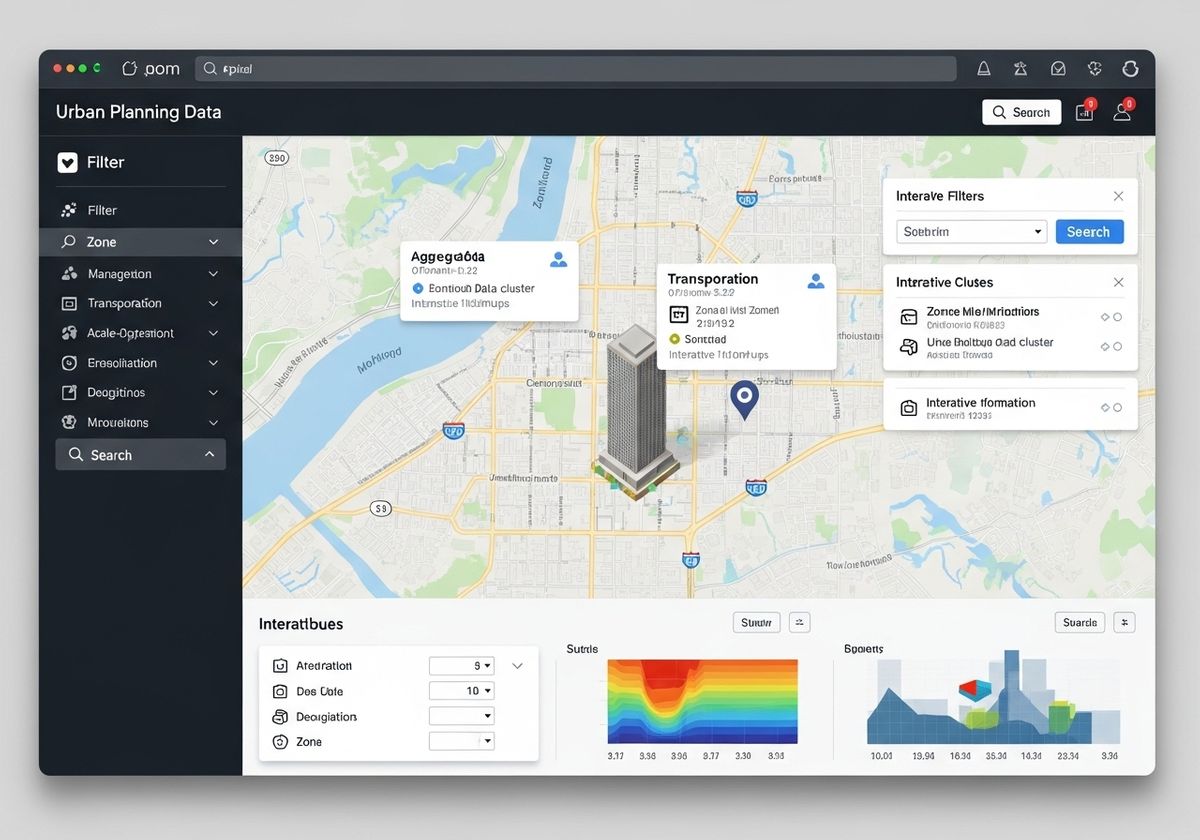
1. Data Filtering and Layering
One of the most effective ways to declutter a web map is by implementing robust data filtering and layering techniques. Allow users to selectively display information based on specific criteria, such as date ranges, categories, or attribute values. Organize data into logical layers that can be toggled on or off, giving users control over what they see. This approach is particularly useful in GIS urban planning, where various layers like zoning, transportation, and demographics need to be analyzed independently or in combination.
2. Aggregation and Summarization
When dealing with dense datasets, consider aggregating or summarizing data to reduce visual clutter. For example, instead of displaying individual data points, group them into clusters or heatmaps that represent density patterns. Summarization techniques, such as calculating averages or totals for specific areas, can also provide valuable insights without overwhelming the user with raw data.
3. Scale-Dependent Visibility
Implement scale-dependent visibility to ensure that only relevant information is displayed at each zoom level. As the user zooms in, more detailed data can be revealed, while less important information is hidden. This approach helps maintain clarity and focus, preventing the map from becoming cluttered with irrelevant details at broader scales.
4. Interactive Pop-ups and Tooltips
Instead of displaying all attribute information directly on the map, use interactive pop-ups and tooltips to provide additional details on demand. When a user clicks on a feature, a pop-up window can display relevant attributes, charts, or images. Tooltips can provide brief summaries of information when the user hovers over a feature, offering a quick and easy way to access additional context. This is especially useful when showing geographic information services data to users unfamiliar with GIS.
5. Clear Visual Hierarchy
Establish a clear visual hierarchy to guide the user's attention and highlight important information. Use distinct colors, sizes, and symbols to differentiate between data categories and emphasize key features. Consider using labels sparingly and strategically to avoid cluttering the map. A well-designed visual hierarchy can significantly improve the user's ability to quickly understand and interpret the information presented on the map. Highlighting a building or location using 3D map rendering can make a significant difference in the user experience.
6. User Interface Design and Navigation
A well-designed user interface (UI) is essential for controlling information overload on a complex web map. Provide intuitive controls for filtering, layering, and zooming, allowing users to easily navigate the map and access the information they need. Consider incorporating search functionality to enable users to quickly find specific features or locations. A clear and intuitive UI can significantly improve the user experience and reduce frustration.

7. Incorporate an Interactive Map for Website
Adding an interactive map for website implementation can greatly improve usability, allowing users to explore features and data points directly. This engagement not only enhances understanding but also extends the time users spend on the site, boosting overall interaction and satisfaction.
Effectively managing information overload is crucial for creating web maps that are both informative and user-friendly. By implementing data filtering, aggregation, scale-dependent visibility, interactive pop-ups, and clear visual hierarchies, you can transform a cluttered map into a powerful tool for exploration and decision-making. At Flyer View Group, LLC, our expertise lies in crafting compelling narratives through data, maps, motion, and graphics. We understand the intricacies of presenting complex information in an accessible and engaging manner. Our services, including GIS/Mapping Services and the creation of data-rich infographics, are designed to help you tell your story effectively. Contact us today to explore how we can help you transform your data into actionable insights, or visit our website to learn more about our comprehensive marketing solutions.